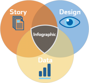
 There are many names for it lately. Information design, data visualizations, or Infographics. There are many names for it lately. Information design, data visualizations, or Infographics.
Informational graphics, or, Infographics, help your readers make quick sense of your most complicated data sets. A well designed infographic can be the difference between a potential customer quickly leaving a boring web page or printed brochure, and being captivated by your information long enough to make an impact. Neurologically speaking, the brain’s sequence of cognition is wired to interpret the shape of visual stimuli first. Next, in the sequence, brain recognizes the color. Color can evoke an emotional response and is more easily remembered if distinctive. Finally, the brain takes the most time to decode the forms or text, as they need to be tied to a meaning. Given, this all happens in a few seconds, however it’s been proven that highly visual information can have more of an impact on memory.1
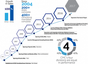
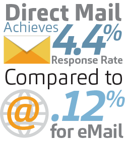
Infographics can transform your site’s data-rich content into an engaging experience for potential customers. Generally, infographics use little running text, but rather employ simple iconography, graphs, and numbers to communicate a complicated concept quickly. In other words, the combination of these elements makes the information easier to digest with a quick look. Infographics typically use a limited color palette, make use of negative space well, and most importantly, have a strong sense of scale. Scale helps call out important elements and guide the eye from point to point. Here are a few sample Infographics from select projects:
Philosophy Phone: 617-256-5929 1 Designing Brand Identity, by Alina Wheeler. John Wiley & Sons, Inc, Publisher. |
617-256-5929 — info@markfielddesign.com


