Listen, Inc. Logo Refresh
markField Design engaged Listen, Inc to redesign or “refresh” their existing logotype. markField Design worked with the Listen team to help them identify the key elements of their existing logo that were integral in their brand DNA. These elements were carried forward into a re envisioning of their brand identity.
![]() CHALLENGE: Listen, Inc. loved the original concept for their logo. They wanted to retain the overall concept, but update the design to a more modern look. They required that the new design keep the “Head”, “Hand”, and “Ear” elements to reinforce the word “Listen” at a glance. Strip out unnecessary graphic language for easy readability. Allow for easy printing and ghosting behind line graphs as well as audio frequency charts.
CHALLENGE: Listen, Inc. loved the original concept for their logo. They wanted to retain the overall concept, but update the design to a more modern look. They required that the new design keep the “Head”, “Hand”, and “Ear” elements to reinforce the word “Listen” at a glance. Strip out unnecessary graphic language for easy readability. Allow for easy printing and ghosting behind line graphs as well as audio frequency charts.
![]() SOLUTION: markField Design choose a heavier and less illustrative graphic language to form a more modern and highly stylized “Head” and “Ear”, while keeping the hand highly simplified. We removed the “Eye” and “Mouth” elements to further simplify the overall presentation by reducing the number of elements needed to suggest a human head. markField Design also choose a more modern typography treatment to help round out the identity. Treating the company name in lower case and eliminating the “Inc.” also gives the result a more approachable feel.
SOLUTION: markField Design choose a heavier and less illustrative graphic language to form a more modern and highly stylized “Head” and “Ear”, while keeping the hand highly simplified. We removed the “Eye” and “Mouth” elements to further simplify the overall presentation by reducing the number of elements needed to suggest a human head. markField Design also choose a more modern typography treatment to help round out the identity. Treating the company name in lower case and eliminating the “Inc.” also gives the result a more approachable feel.
BTHR Solutions Brand Architecture & Website Redesign
markField Design worked with BeneTemps during their rebranding effort to become BTHR Solutions. markField Design worked with the BeneTemps team to help them develop a solid brand architecture and consolidate their marketing communications materials both online and offline.
 CHALLENGE: BeneTemps had a number of products and services, all working under different brands with a only a loose tie to the parent company, known as BeneTemps. BeneTemps had significant name equity in the marketplace which the client did not want to sacrifice. BeneTemps wanted to retain their brand equity, while renaming the company and pulling all of their products under one cohesive look and feel. The only parameter was that they wished to retain the graphic mark utilized within their current materials.
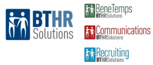 SOLUTION: markField Design first consulted with BeneTemps on their name change. Over the years, BeneTemps had some traction with being reduced to “BT”. Their primary service was always quality HR solutions. This gave BeneTemps the opportunity to rebrand themselves as BTHR Solutions. Their primary service brands would fall under the umbrellas of BeneTemps for HR solutions, Communications for outsourced HR communications, and Recruiting for HR permanent placement. markField Design developed a brand architecture based around BTHR Solutions while retaining the existing graphic mark.
Marketing Evolution Brand Refresh
markField Design engaged Marketing Evolution to redesign or “refresh” their existing logotype. markField Design worked with the Marketing Evolution team to help them identify the key elements of their existing logo that were integral in their brand DNA. These elements were carried forward into a re-envisioning of their brand identity.
 CHALLENGE: Keep the “feel of a compass” and eliminate the tagline. Strip out all unnecessary graphic language for easy readability. Tweak the color palette, but keep it in the same color families. Update the typography for a more modern feel.
![]() SOLUTION: markField Design choose a more modern font treatment and separated the two words with two different weights and tonal values. By keeping similar shapes of the compass, markField Design has achieved some continuity with the existing brand equity, but stripped out all unnecessary information that was overpowering the original logotype.
SOLUTION: markField Design choose a more modern font treatment and separated the two words with two different weights and tonal values. By keeping similar shapes of the compass, markField Design has achieved some continuity with the existing brand equity, but stripped out all unnecessary information that was overpowering the original logotype.